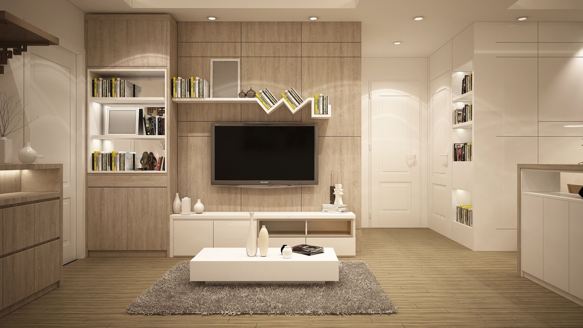
Design’s solo dance: Monochrome elegance
Choosing the perfect color scheme for your home can be challenging. You need to think about the mood you want to set in your space and how much natural light it receives. Plus, there’s the concern of committing to a color choice that you’ll be happy with for a long time.
In the world of colors, there are no guarantees, but going for a monochrome color scheme makes things simpler than trying to mix multiple hues. Opting for a single color eliminates the complexities of pairing two or more colors together.
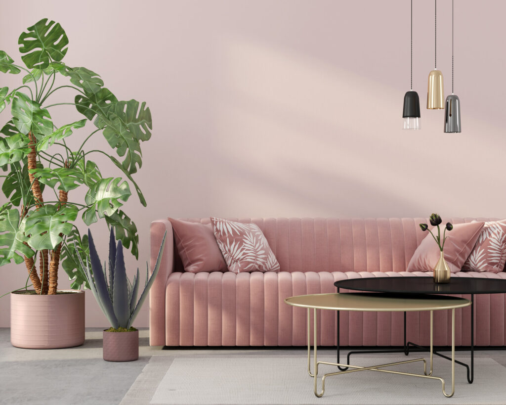
Defined by the use of a single color in varying shades, tones, and tints, monochrome Colour scheme creates a harmonious and sophisticated aesthetic that resonates across diverse design styles. From minimalist modern to classic and opulent, the monochromatic palette offers a versatile canvas for crafting captivating interiors.
The Essence of Monochromatic Colour Scheme

Simplicity & Depth with Monochrome Colour Scheme
The monochromatic color scheme simplifies the design process by focusing on one primary hue. However, this simplicity doesn’t equate to blandness; instead, it invites depth and nuance. Through the artful juxtaposition of lightness and darkness within the chosen color family, a monochromatic space gains dimension and visual interest.
Creating Visual Cohesion with Monochrome Colour Scheme
One of the remarkable attributes of a monochromatic palette is its ability to create a sense of visual unity. The seamless blending of various shades of the same color throughout a room fosters a cohesive and balanced atmosphere, enhancing the overall visual appeal.
Emotional Impact with Monochrome Colour Scheme
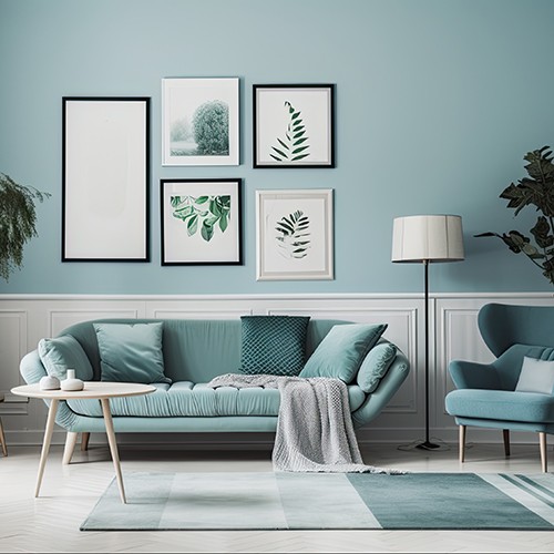
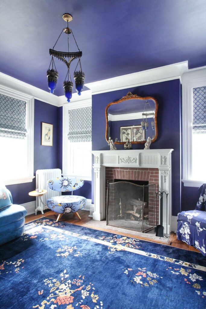
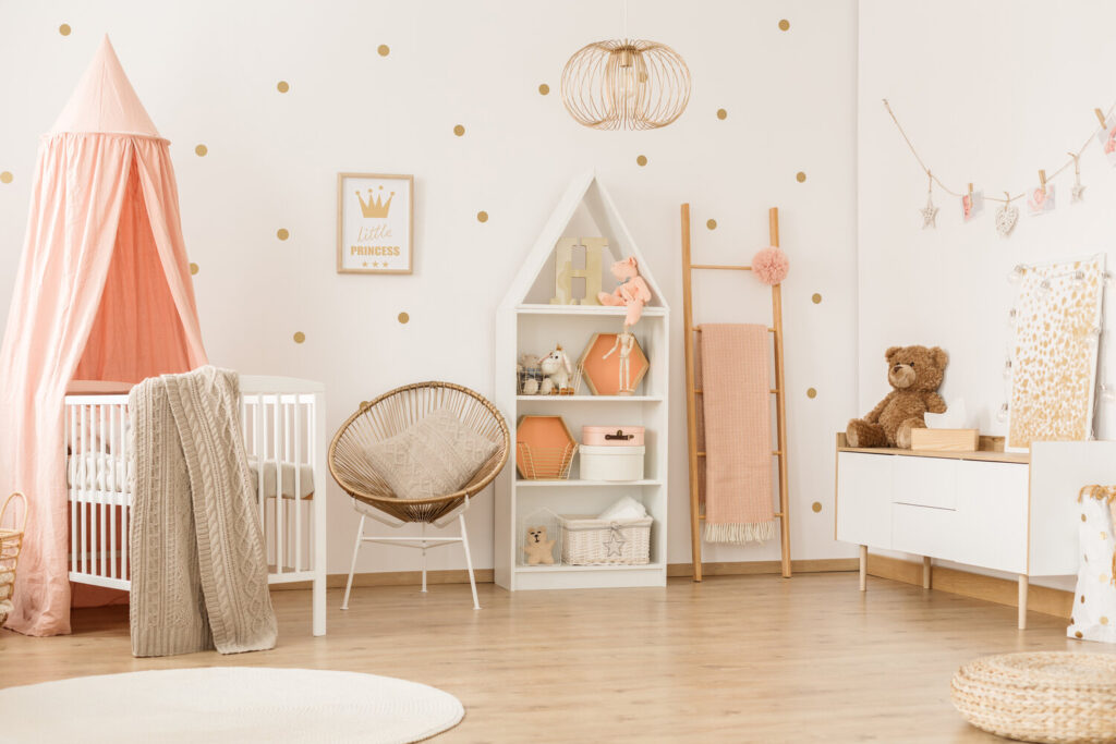
A monochromatic palette has the remarkable ability to evoke specific emotions and moods through the chosen color. For instance, a room adorned in various shades of blue might promote a sense of calmness and tranquility, while shades of red can add warmth and energy. Understanding the psychological impact of color aids in creating atmospheres that resonate with the occupants.
Enhancing Architectural Features with Monochrome Colour Scheme
By employing a monochromatic color scheme, the focus naturally shifts towards the architectural elements of a space. Highlighting features such as moldings, beams, or structural details with varying shades of the chosen color can elevate the overall aesthetic, adding depth and character to the room.
Spatial Perception with Monochrome Colour Scheme
Monochromatic palettes can manipulate the perception of space. Lighter tones tend to make a room feel more expansive and airy, while darker shades can create intimacy and coziness. Skillful use of color variations can visually alter the dimensions of a space to achieve the desired ambiance.
Harmony with Accents with Monochrome Colour Scheme
While the primary focus remains on a single color, the introduction of accent hues can amplify the visual impact. Strategic use of contrasting or complementary colors in small doses—such as through artwork, accessories, or furnishings—can create focal points and add vibrancy without disrupting the overall monochromatic harmony.
Artistry in Shades and Tints with Monochrome Colour Scheme
The artful interplay of different shades, tints, and tones within the same color family showcases the subtlety and depth of a monochromatic palette. From soft pastels to rich, deep hues, the versatility of a single color allows for a wide spectrum of expression, enabling designers to craft captivating compositions.
What is a Monochromatic Colour Scheme and How to implement it into you design:
A monochromatic color scheme revolves around using variations of a single color to create a cohesive and harmonious look within a space. Implementing a monochromatic color scheme involves careful selection, balancing of tones, and strategic use of textures to achieve an elegant and visually appealing design. Here’s a guide on what a monochromatic color scheme is and how to implement it into your design:
Understanding a Monochromatic Color Scheme:
Monochrome Marvel – Single Color Dominance:
A monochromatic color scheme focuses on one primary color, utilizing different shades, tones, and tints of that color throughout the space.
Variation in Saturation:
It incorporates a range of saturation levels, from lighter tints to darker shades, creating depth and visual interest while maintaining color unity.
Texture and Contrast:
Textures, patterns, and finishes play a crucial role in adding depth and dimension to the design. Contrasting textures within the same color family help avoid a monotonous appearance.
Implementing a Monochromatic Color Scheme:
Let’s delve deeper into each step of implementing a monochromatic color scheme to create a well-rounded and engaging design:
Choose the Base Color:
Consider the Mood:
Determine the atmosphere you wish to create. For instance, serene blues or greens can evoke a calming ambiance, while warmer tones like red or orange can add vibrancy and energy.
Harmonizing with Existing Elements:
Take into account the existing furnishings, architectural elements, and fixed features in the space. Choose a color that complements these elements rather than clashing with them.
Explore Variations:
Undertones and Complementary Shades:
Understand the undertones of the selected color. Experiment with different shades and tones within its spectrum to identify complementary colors that enhance the overall palette.
Color Psychology:
Delve into the psychological effects of different shades. Lighter tones might promote openness and airiness, while darker shades can induce coziness or drama.
Create Contrast:
Texture Play:
Incorporate various textures such as natural fibers, metals, woods, or fabrics to introduce visual interest. Contrast smooth surfaces with rough textures to add depth and tactile appeal.
Finishes and Reflectivity:
Balance matte and glossy finishes. Matte surfaces absorb light, while glossy ones reflect it, creating a play of light and shadows that adds dynamism to the design.
Focus on Layers:
Depth and Dimension:
Layering doesn’t just pertain to color; it’s about creating depth in the visual composition. Use furniture, accessories, and decor elements in different tones to create visual layers.
Wall Treatments and Accents:
Consider accent walls, textured wallpapers, or artworks that enhance the layering effect. Subtle variations in wall treatments can significantly impact the room’s aesthetic.
Consider Accents:
Strategic Placement:
Infuse accents sparingly to avoid overpowering the monochromatic palette. Use them strategically in focal points or areas where visual interest is needed.
Complementary Colors:
Accents can introduce complementary colors that harmonize with the base color, amplifying its impact without deviating from the monochromatic theme.
Pay Attention to Lighting:
Layered Lighting:
Use a combination of ambient, task, and accent lighting. Properly positioned lighting fixtures highlight different shades and textures, enhancing the overall ambiance.
Natural Light Utilization:
Leverage natural light to showcase the varying tones of the chosen color. Window treatments can be adjusted to control the intensity and mood of the space.
Test and Adjust:
Sample Application:
Apply small swatches or samples of different shades in the space to understand how they interact with the room’s lighting and architecture before committing to larger areas.
Iterative Approach:
Continuously evaluate and adjust the color balance until achieving the desired harmony and depth within the space.
Strike a Balance:
Cohesive Flow:
Ensure a smooth transition of the monochromatic palette throughout the entire space, maintaining a consistent and harmonious visual flow from room to room.
Visual Weight Distribution:
Balance the distribution of darker and lighter tones within the space to create a harmonious composition without overwhelming specific areas.
Evaluate the Overall Effect:
Holistic Assessment:
Step back and assess the space from various angles to gauge how the chosen color scheme interacts with the room’s architecture, furnishings, and overall ambiance.
Functional Alignment:
Ensure that the chosen monochromatic scheme aligns with the practical needs and functionalities of the space while meeting the desired aesthetic goals.
That’s a Wrap!
Mastering the art of monochromatic design is like painting a canvas with a single color but infinite possibilities. It’s not just about picking a color; it’s about exploring its shades, playing with textures, and balancing light and dark to create a space that’s both cozy and captivating.
In this design journey, understanding how colors affect vibes is key. Whether aiming for calmness or energy, each hue brings its own story to the room. Mixing textures and finishes adds depth – smooth with rough, matte with glossy – creating a visual symphony that keeps the eye intrigued.Strategic pops of accent colors are like delightful surprises, adding zing without overshadowing the main hue. Lighting plays its part too, highlighting the color spectrum and setting the mood.
It’s all about trial and error, playing with samples until the perfect balance is struck. The goal? Ensuring a smooth transition from one room to another, creating a cohesive flow that’s pleasing to the eye and comforting to the soul.
In the end, mastering monochromatic magic isn’t just about design; it’s about creating an atmosphere, a feeling. It’s a blend of simplicity and sophistication that makes a space not just beautiful but uniquely yours.
FAQ’s
Select a color that resonates with the desired mood and complements the space’s function. Consider existing elements and furnishings in the room. Also, experiment with different shades, tones, and undertones of the chosen color to find the right balance.
Absolutely! Mixing various textures and materials within the same color family is key to adding depth and visual interest. Combining smooth surfaces with textured fabrics, or matte finishes with glossy accents, enhances the overall appeal of a monochromatic space.
To avoid monotony, focus on creating contrast. Use different shades and tones of the chosen color, introduce subtle accent colors sparingly, and play with textures and finishes. Layering and incorporating diverse elements will add dynamism to the space.
Lighting is crucial in highlighting the different shades and textures within a monochromatic scheme. Experiment with layered lighting—ambient, task, and accent lighting—to accentuate various elements and create depth within the space.
While a monochromatic scheme primarily revolves around one color, incorporating small accents of complementary or contrasting colors can enhance visual interest. However, ensure these accents remain subtle to maintain the overall harmony of the color palette.